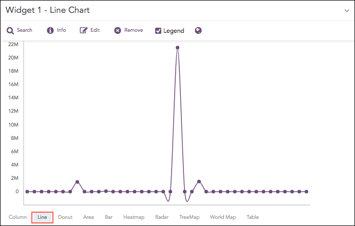
The Line chart displays information as a series of data points called markers. The markers are connected to each other by a line.
The Line chart consists of two axes, in which x-axis contains the value of the grouping parameter(s) and the y-axis contains the values of the aggregation parameter. It is similar to a Column chart, except that, a Column chart usually displays discrete values, whereas a line chart visualizes a trend in continuous data.
Count of logs
The following query gives the output shown above.
source_address=* | chart sum(datasize) as Datasize by source_address
The Line chart supports two aggregation response types for representation of search results in the visualization. They are:
Response Type |
General Syntax |
|---|---|
| chart aggregation_parameter by grouping_parameter1, grouping_parameter2, ........, grouping_parametern
|
|
| timechart aggregation_parameter
|
Example:
severity=* | chart count() by severity
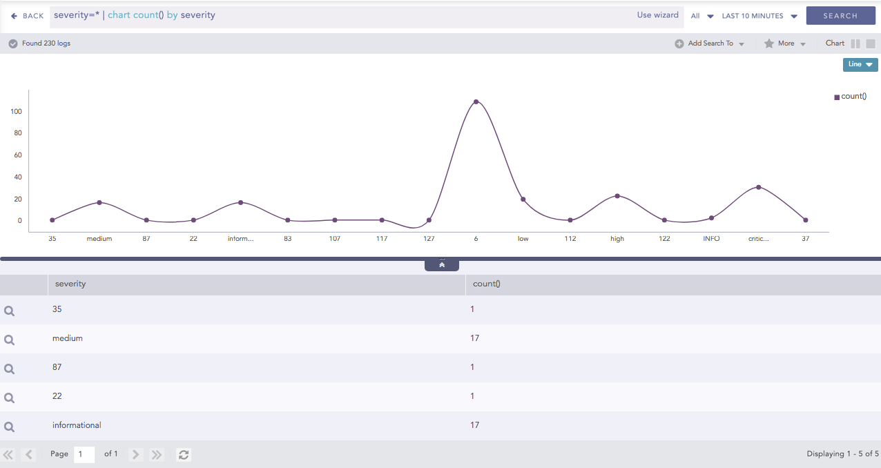
Line chart for Single Aggregation with Grouping
You can refer to Single Aggregation with Grouping for more details.
Example:
| timechart avg(datasize)
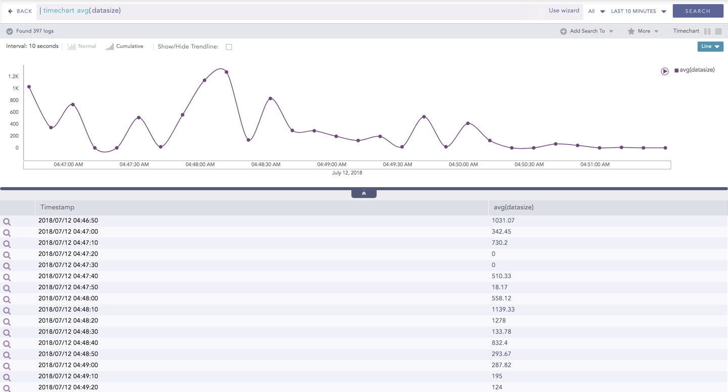
Line chart for Timechart Single Aggregation without Grouping
You can refer to Timechart Single Aggregation without Grouping for more details.